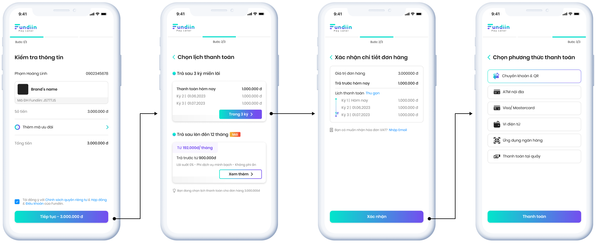
Project Overview
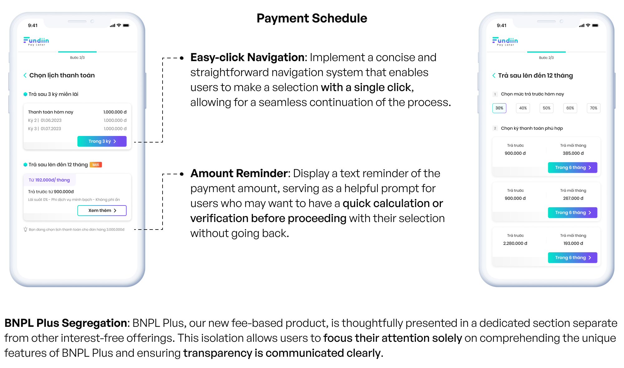
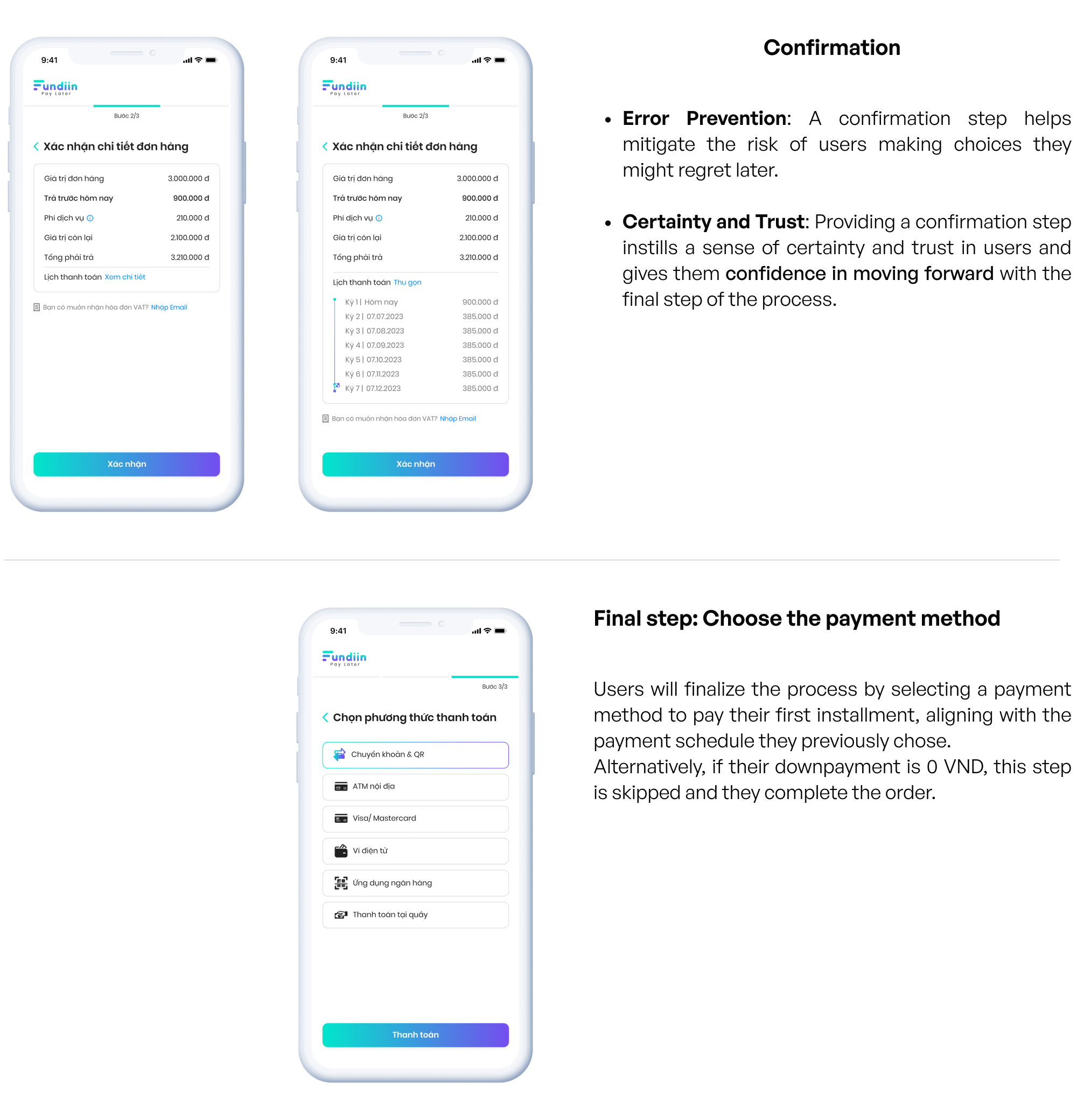
The purchase flow has been completely redesigned to match the branding colors and styles.
Additionally, it provides a clear differentiation between interest-free and fee-based products.
This redesign has resulted in buyers more quickly understanding the concept and feeling confident in making a decision step by step, focusing on small tasks at a time, resulting in quicker time.
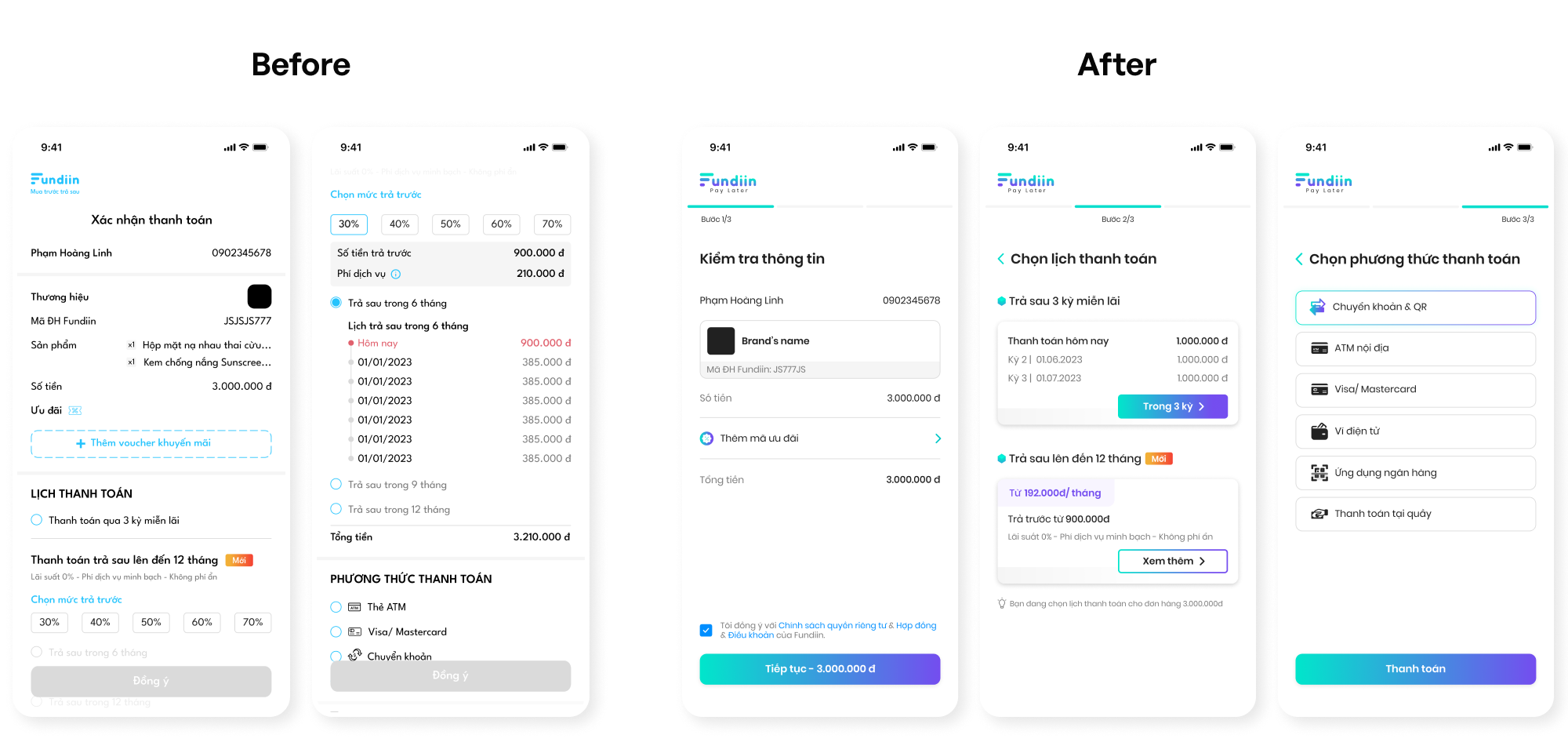
The Problem
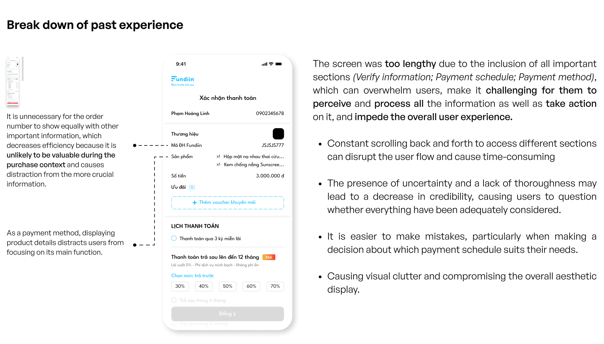
The previous version of the purchase flow presented an excessive amount of information on a single screen.
This overloaded users with an abundance of text, options, and details. As a result, users had to spend extra time reading back and forth, evaluating options without confidence in completing the purchase. Additionally, the previous layout diminished the overall aesthetic appeal and professionalism of the interface, eroding credibility.